
On a cell phone, this webpage is best viewed in landscape.
CONSUMER SPENDING AND THE BUSINESS CYCLE
I have retired and no longer provide commentary. I update my charts periodically or use St Louis Federal Reserve Bank's FRED charts; there click customize to see additional data resources or analysis.
You can find commentary at:
Important
My method is to compare the rate of change, a percentage, to the same period last year. The pandemic will/has distorted that data subject to a base effect. Several years will need to pass for the huge declines in 2020 to flush out of the math from the large swings in measures.
As Wikipedia explains, a base effect for inflation from the corresponding period of the previous year is where the Price Index was much lower then due to the Covid Shock, so even a smaller rise in the Price Index now will arithmetically give a higher rate of inflation. Often "economics" press commentary distorts (sometimes they are disingenuous) current trends.
THE THREE DRIVERS OF ECONOMIC GROWTH
Real PCE, spending on consumer goods and services adjusted for inflation, is the largest dollar value of Real GDP.
My rule of thumb to sustain Real GDP expansion at 3% or greater for several quarters is that real Personal Consumption Expenditures (Real PCE) have increased at 2.5% (threshold) over two quarters (momentum), compared to the same periods last year.
In this chart, the steeper the rising slope of the Real PCE change predicts how long Real GDP growth will exceed 3%. Another Real PCE pattern to observe is a rapidly declining slope, a cause for a recession if consumers sit on their wallets (Real PCE quarter over quarter rate of change rapidly falls below 2%).

*Bear Markets are "called" when there is a 20% or more in aggregate stock value loss for 3 or more months, the dates here from MSNBC. A correction is market loss
of 10% or greater for a few months.
**The "Austerity Low" describes that Real PCE declined from Q111 to Q114 when Congress implemented a austerity strategy following the Great Recession.
The net effect of reduced government spending was delayed investment, hiring and across the board wage increase.
Private Fixed Investment, the second most impactful dollar value of real GDP growth. Over time, Residential Investment (new homes and equipment - here the red line) included in Private Fixed Investment has been a leading indicator of Real GDP growth or decline. Nonresidential Investments are business structures, equipment, and intellectual property.

Government Consumption Expenditures and Gross Investment (Fed-State-Local) is the third most impactful dollar value of Real GDP growth.
Much of Federal spending is financed by borrowing. Note the interest on the Federal Debt per capita at the bottom of this chart.

Federal Debt Percentage of GDP
Relative Magnitudes over time of Nominal PCE, Government Spending/Investment, and Fixed Private Investments.
Same chart with Government breaking out State-Local and Federal Shares
The Cup and Handle
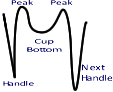 At university, I was taught that bond investors, a conservative lot, anticipate future economic growth peaks or troughs looking for the "coffee cup." In a recession, the Fed "buys" longer term yields down to attract borrowers and spur manufacturing, the handle. Emerging from the recession, Real PCE growth peaks as spending accelerates (left side of the cup), settles down (the bottom of the cup) and then peaks again as inflation creeps in before onset of the next recession (the right side of the cup). People often say as the right side forms, the economy is "heating up," evidenced by inflation as fixed security yields rise as bond prices fall. Often the 2yr-10yr Constant Maturity Treasury spread inverts as the right side of the cup forms. Observing for the cup is a very old, simplistic assessment technique.
Real Personal Consumption Expenditure is the largest percentage contributor to Real Gross Domestic Product. Other contributors rise and fall from effects of spending on consumer goods and services.
Nominal PCE's Contribution to Nominal GDP at the Inception of a Recession can increase rapidly as other contributors percentages retreat; for example, Real PCE rises rapidly as Residential Fixed Investment falls (coincident), except the Covid Shock.
The Rate of Change to Real PCE compared to the previous business cycles continued to show less volatility compared to the trend line until the Covid-19 Recession, a shock to the economy not triggered by the business cycle, which has few historical parallels or academic analysis to suggest how the recovery will proceed.

Same chart from St Louis FED FRED - Change in Real PCE to same period last year
Real GDP Conributions

Real GDP Annual Change To Previous Year from 1949 (SAAR) summary
BEA Percent Change From Preceding Period in Components of Real Gross Domestic Product Last 10 Quarters (SAAR) drivers
Real GDP per capita momentum
GDP estimates:
Industrial Production Since the 1920s
Real PCE and the more volatile Industrial Production Index percent change compared to the same quarter last year.

More fine grained than by quarter, Institute of Supply Management PMI® reports and FRED data on Manufacturing Sectors. A supply chain proxy is the Drewry World Shipping Container Index assuming those cost changes coincident with supply chain efficiency.
Inventory to Sales Ratio. When demand for goods is what businesses expect, the ratio holds steady; but when businesses inventories rise or fall significantly, the ratio will swing.
New Durable Goods Orders, the inventory for the big ticket purchases included in PCE.

Quarterly to smooth data - Durable Goods Quarterly Fed G17 Current
Light Weight Vehicle Sales show consumer spending patterns.

Interest Rate Patterns to Durable Goods Orders and Inventories — Stuff Happens.
If durable goods sales slow, inventory builds, replenishment orders slow. Vice versa, consumers buy, inventories fall and manufacturers move to restock. Consumer spending and working capital borrowing as interest costs rise or fall predicate the business cycle.
If borrowing costs to produce durable goods rise, the extra interest costs to build inventories is less attractive, a classic leading indicator for a recession since the 1940s. Restated, interest rates increasing slows manufacturing of durable goods. The Fed also raises it's discount rate to slow inflation, which also effects consumer purchases and manufacturing.
In my business lifetime, I helped my clients anticipate interest moves (poorly), reduce working capital costs, and improve process using Japanese best practice (tutored by Deming). I was one of "the herd" stampeding towards high analytical approaches to cost reduction.
It worked when 1970s high-inflation did not come back after Volcker's tight money tenure (1979-1987) at the Fed. Fed Chairman Bernanke (2006-2014) called this calm period starting in 1989 the Great Moderation. To keep interest rates stable so business planning/financing would be more predictable, Greenspan (1987-2006) Fed's monetary policy was well timed and, to cut costs, activity based management and supply chain management methods (me) narrowed the peaks to troughs in durable goods and food production. Consumer spending grew and the country could not build enough homes to meet the demand. Mortgages got repackaged and resold at a profit. We all thought that time "it was different."
Greed, boom, bubble burst, the 2007-2008 Financial Crisis — Great Recession (and later Covid Shock) demonstrated that our economy is very complicated, the herd can still run (be pushed) over a cliff -- stuff happens.
In this chart the Inventory and Orders Rate of Change to the Previous Year on the left Y axis's scale
is proportional to the Fed Discount Rate on the right Y axis's scale, which exaggerates magnitude but
not the timing of Fed discount rate changes.
The Fed Funds Rate, Fed Funds Effective Rate and nightly Interbank trading rates explained.
Consists of purchases of residential and nonresidential structures, equipment and intellectual property products by private businesses, by nonprofit institutions, and by governments in the United States. FI is used to sustain and grow the economy.
Change in Fixed Investments year to year (Nonresidental separated into private and government).

Gross Government Investment has been volatile since the Great Recession and trending down since WWII, a structural problem.

Government Investment per capita has declined dramatically.
How much cash can a person, families, businesses, and governments borrow? Are they over-leveraged?
Household versus Federal Debt.
From the FRED Blog, "Household debt in the U.S. increased from 59% of GDP in 1990 to 98% of GDP in 2009, and many economists argue that the Great Recession was “Great” because household leverage was so high at the time."
Per capita Nominal GDP, Nominal PCE, Federal Debt and Interest, the interesting observation is interest per capita.
For more detail see Federal Debt Percentage of GDP
Nonfinancial Corporate Debt, the rate of change from same period last year.
Nonfinancial Corporate Debt as a percentage of GDP (NSA).
Baa Corporate Rates (Monthly) and Business Loan Delinquency Rates (Quarterly).
Household Debt in dollars per capita.

Household Debt Service Payments as a percentage of Disposable Personal Income.
Household Debt Service Ratio (blue line)

BEA: Disposable income is the total after-tax income received by persons; it is the income available to persons for spending or saving
Delinquency Rates, watch for them ticking up.

Delinquency Rate on Single-Family Residential Mortgages year over year Rate of Change
Mortgage Foreclosure Rates from Blackknight
The more jobs, the more money circulating in the economy.
Two outstanding questions due to the pandemic, who will retire?, and when will the younger cohorts, Gen Y (Millennials) and Gen Z, aggressively join the work force?
Labor Force Participation Rate in the USA 16 years old or older has declined as baby boomers retire and should rise soon as more Millennials (Gen Y) and Gen Z adults enter the work force.

Personal Consumption Expenditures (PCE), hiring lags spending growth.

The Rate of Change in Hiring.

For more details, see the Bureau of Labor Statics (BLS) Job Openings and Turnover Survey (JOTS)
KC Fed's Labor Market Conditions Indicators (LCMI).
Link to recent analyses on hiring momentum
Unemployment Level, and Nonfarm Hires, Openings and Separations.
Job Openings by Industry and Region
Employment Compared to Capacity Utilization, which has continued to decline, a troubling structural change.

Participation Rate 25-54 Year Olds (prime working years cohort) should improve as Millennials (Gen Y) and Gen Z adults get jobs.

The Future.
With Manufacturing employees (blue line, declining) & Service Employees (red line, growing) as the Gen X and Gen Z generations cohorts join the work force, their Medicare and Social Security taxes will fund the benefits.

Manufacturing v Service Average Hourly Earnings Percent Change to a Year Ago
Increases in PCE lead to more jobs should lead to better wages with a lag.

Atlanta Fed Median Wage Growth Tracker.

Government Often Acts to Increase Income Growth.

Funding Lifestyle (PCE) from Earnings or Saving during uncertainty.

Savings Rate of Change, rising a leading indicator Real PCE dropping and vice versa.
Real Disposable Income per capita. During the Covid Shock, did more money flow or not?
The Fed target for core PCE growth is 2% year over year. The Cleveland Fed has inflation predictions.

Summary of core CPI and PCE differences and a wonkish explanation The Great Moderation
Comparing Nominal to Real PCE, the green line is the PCE deflator, another measure of inflation.
Core PCE (less food and gasoline) and wage pressures.

Private Residential Investment (new single family homes or multi-unit homes and the resulting purchases of home stuff) is a leading indicator of real GDP growth or decline.
See Bill McBride, CalculatedRisk, for recent details.
 ,
,
BEA Private Fixed Residential Investment Components
Home Ownership Rate compared to Rental Property Vacancies, which move in tandem.
Gen Y (Millennials - now) and Gen Z (just beginning) generations are at the age to purchase their first house, yet many continue to rent.
30-Year Fixed Rate Mortgage Rates.
See current rates and history here.
Housing Starts usually accelerate with low mortgage rates.
")
New Homes Starts, Permits and Months of Supply.
6 months or greater supply of new homes for sale indicate a normal market.
")
New Home Median Prices.
House Prices Change Relative to Consumer Price Index.

Household Mortgage Debt as Percent of GDP, lower than during Housing Bubble.
Advance Real Retail and Food Services Sales (SAAR).
Percentage Change for Retail Sales from the same month last year.
Retail and Food Service Sales ex Gasoline Compared to Nominal PCE.

Advance Retail Sales: Food Services and Drinking Places (leading indicator), Latest Census Bureau Excel
RISK
Fundamentally, families understand the risk of being over-leveraged from memories of the 2007-2009 Great Recession - Household Debt Crisis. The school of hard knocks question for families, how do save, spend or borrow cash given perceptions of day-to-day risk?
A bond's yield is the annualized yield an investor earns by holding the bond to its maturity date, face value and interest recieved. The annual payment is called the coupon rate (in the past the bond owner sent a coupon to the issuer to demand the annual payment), and the cash returned to the investor at maturity is the face value. When a bond is issued (auctioned off) by the Treasury, older bonds' market value if sold rise or fall invesely to the new last auction's interest rate. Restated, bonds sold over the counter market values rise or fall depending on the current new bond interest rate. Corporate bonds, mortgages, loan interest rates follow Treasury rate movements.
Spreads on yields for Federal securities sales in the over-the-counter (OTC) market predict recessions are proxies for our economic system's risk. Usually, when the 2 Year Treasury yield minus the 10 Year Treasury yield is greater than zero, a recession follows, a leading indicator. Recessions (risk) effect families day-to-day decisions.

Bond buyers and sellers (and this retired consultant) estimate future risk considering inflation, central banks' monetary policy, and business conditions, and there are thousands of influencers for a business's sustained growth or a decline. Inflation and supply chain choke points are the causes célèbres du jour.
Treasury yield movement OTC is the day-to-day measured response to those considerations, a "snapshot" of our economic system's trends and perceptions of risk.
It is easy to follow Treasury yield movement from daily US Treasury reporting of Constant Maturity Treasury (CMT) daily yields OTC, also easy to jump to conclusions.
The OTC market is vulnerable, a decentralized trading environment where idiosyncratic bonds must be matched with willing buyers.
From Politico: "Ordinarily, investors unsurprisingly demand higher returns on their money when they commit it for a longer time period (10 years) than a short one (two years). When that reverses, [demand higher returns for shorter time periods,] it can mean bond investors think growth may be stalling out."
Buying or selling bonds, Treasury or Corporate, some considerations:
If Treasury yields are rising and prices declining, do investors avoid buying long-term maturing bonds and shorten the maturity of their bond portfolio, or weather the price declines by holding the bonds to maturity? Will businesses slow borrowing cash as interests costs rise? Will Banks be lending aggressively by decreasing interest charges if their cost of borrowing rises? Will corporations issue new bonds? Will weather-the-storm behavior spread to reduce the cash businesses can add to their balance sheets to fund growth?
Refinancing debt can be a problem. Corporate bonds for resale over-the-counter are harder to come-by; few entities have inventories of mid-term corporate bonds. Most of the refi market is comprised of bank loans or new corporate bond issuance, which compete with Treasury auctions. What is my yield premium for corporate bonds, can I afford a higher interest bank loan?
As an investor, do I move out of bonds as yields rise and rices fall, will stocks offer higher appreciation?
Spread on Moody AAA Corp Bond Yield to 5 Year CMT
This spread measures movement the yield premium investors demand for corporate bonds to forego safer Treasuries.
If yields rise - prices fall rapidly for Treasuries across the OTC bond market, bond investors could park cash in safer Treasury securities after a trigger event or shift to stocks for appreciation.
The trigger can have many celebrity sources: a central bank decision to raise their lending rates to steer inflation down (monetary policy - in the USA the Federal Funds Rate), that affects press analysis of commercial bank lending rates to businesses and corporate bond issuance; a "normal" business cycle correction anticipated by the financial press; a surprise — a banking liquidity crisis (2009) or, who knew, a societal threat - a pandemic (2020); or a wide spread market perception contrary to the data — causes of the rising inflation? The devil is too few details.
Conversely, during periods of global uncertainty, there is usually a flight to quality, often to 10-year Treasuries, and, as a result, that yield will declined sharply.
Long-Term Risk
A market proxy for long-term risk, that business conditions will deteriorate, is when the Treasury yield curve "inverts,” when shorter-term Treasury yields are higher than longer-term yields. Leading inversion, yields converge as spreads between long- and short-term Treasuries for sale approach zero. What market perception is causing the Treasury CMT yields to converge or diverge?
Conversely, when Treasury yields are trending lower for short-term securities and with a lag, for long-term securities (but higher than short-term ones), the yields diverge. The future is more "predictable," usually accompanied with stable modest inflation. When there is less perceived risk, businesses can borrow to grow, and bond sellers get a higher price on the over-the-counter market. As CMT yields converge, the economic press calls that "flattening the curve."
Building up, borrowing, or using cash is the ebb and flow of our economic system, and there is personal risk if you make a timing mistake. That risk is the same for government and business decision makers; their actions reflected as CMT rates diverge or converge.
In this chart, you see CMT yields converge in 2006 and in late 2018, and now converging again?

Private Fixed Investments and the 2-10 Spread
My method is to burrow into the weeds and then come back up with an easy to explain "rule of thumb." My experience with CEOs, they do too.
The 2 year minus 10 year CMT spread of dropping through 0 after an inversion usually triggers holding off on funding private investment. Dropping through -200 basis points (BPs) usually triggers private investment, reportedly an Allan Greenspan rule of thumb.
In normal words, when in the Treasury OTC market 10 Year Treasury yields are 2% greater than 2 Year Treasury yields, Treasury buyers are anticipating a "predictable, stable future," and fixed investment builders usually begin projects, borrowing for a longer term. Most commercial lenders use 10 Yr Note yields as a benchmark to set interests rates. In the chart -200 basis points is a 2% spread.
In the blue line below (when inverted) see the Handle and Cup.
Note that I divided -200/10 = -20 to keep X and Y axis proportional, and I subtract the 2 year from the 10 year so increasing Private Investment slopes up. Many others spread charts subtract the 10 year from the 2 year and invert the left and right axes.

A Practical Guide to Strategic Planning
©Arthur Clinton Burdett III- All Rights Reserved
These observations are not investment advice.
All the data used to produce my graphs for observations on the economy are available to the public from USA Government sources, use of which is not protected by a copyright or restrictions.
In text where needed there are links to copyrighted materials original source, replacing a footnote attribution.
For St Louis FRED charts, see citation on the charts or FRED page for the source and any restricted use.
All graphs indicate the data sources.
Privacy Policy | Table of Contents


