Absolute comparisons
Use quantitative data when it is available; be very careful to use the
same units, to use a consistent scale, and to present
the
time lines consistently. A trap to avoid it assuming time is always
linear. Check the data by seasons as well.
Use graphics to present data to your team, where the axes scales clearly
display the units. Our eyes, the world's best computer, quickly spot the
direction and shifts in magnitude over time.
If you have good sources of quantitative information, show as much
historical data as you can. The rule of thumb is at least three
to five years of
history. No one I've worked with will guarantee the accuracy of forecast
more than two years into the future. Accept that. Beyond two years,
you
will be guessing.
Airport Capacity Example
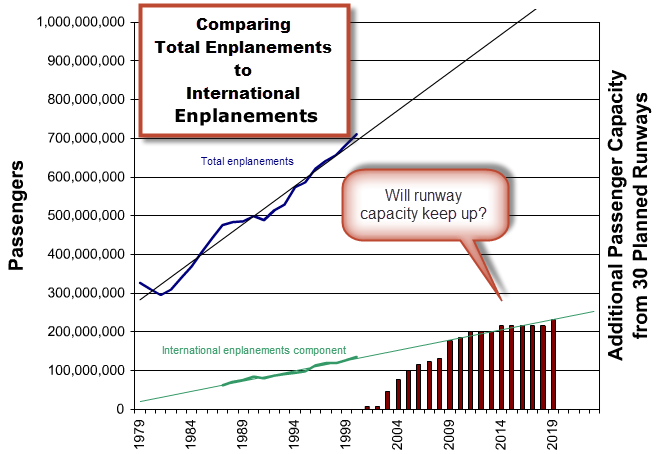
For example, consider the demand and capacity drivers impacting the
aviation industry. The blue line is total passenger enplanements and
the green line
is total foreign travel enplanements, each with a linear extrapolation.
The bars are added capacity for planned runways. One new runway can
handle
about 7.8 million passengers a year.

Current construction suggest future shortages as runway construction
fails to satisfy demand, particularly domestic travel. As delays increase,
it creates years of opportunity
for firms providing alternate transportation or optimizing the current
national airspace system.
As I prepared this example, I noted that most of the runway construction
was not at the airports that support international travelers. There are opportunities here.
Total USA Retail Sales Example
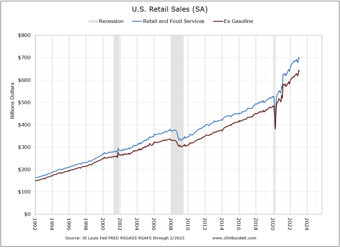
Three charts about Total Retail Sales demonstrate why to drill down.
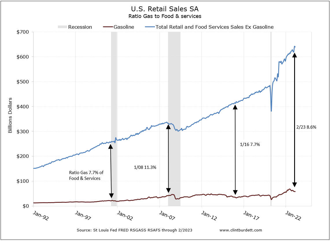
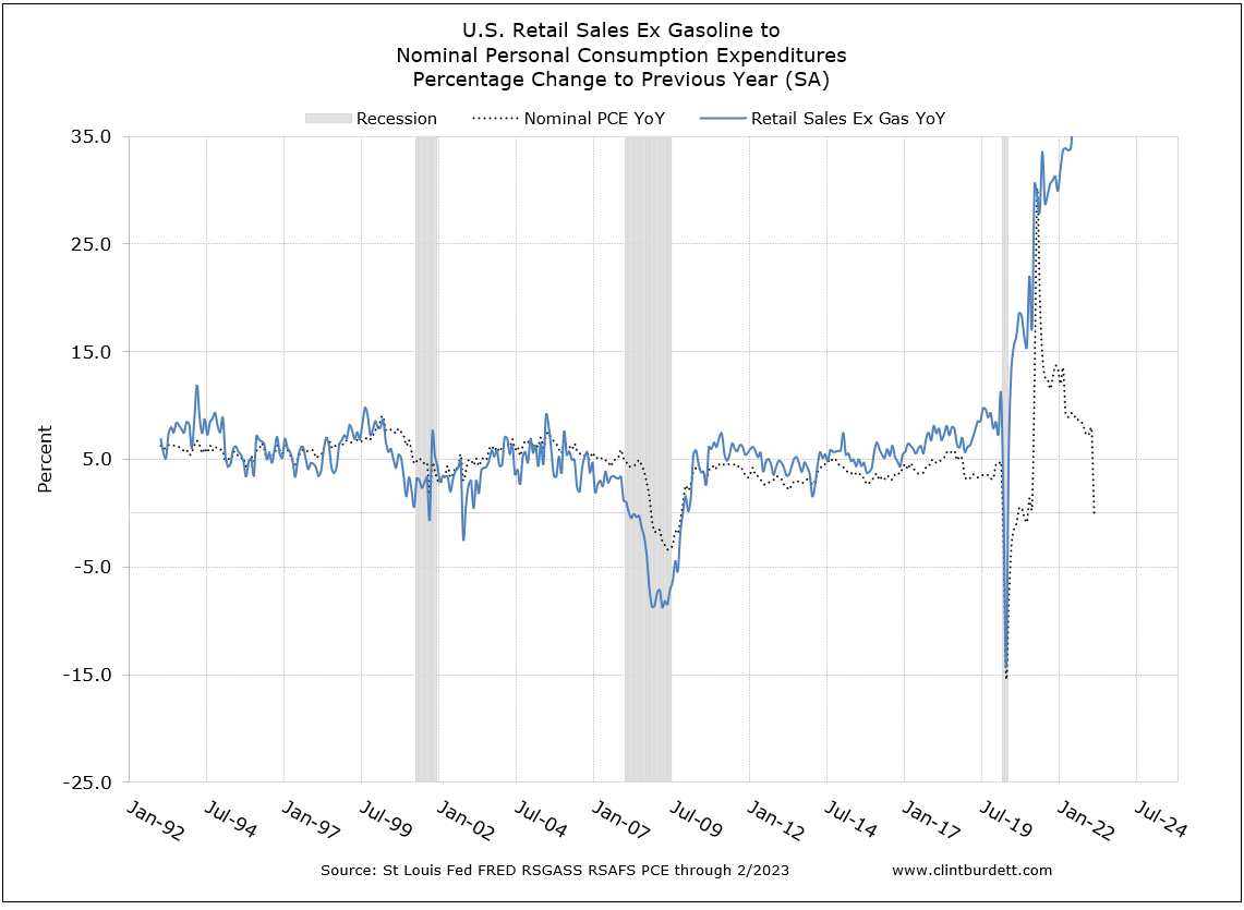
The first chart suggests retails sales are taking off; the second suggests gas is less "critical" in our spending decisions; but the third shows the retail sales growth rate is slowing down -- all from the same data.
Retail sales are returning to the slope of the historical trend, having lost 41 months after the end of the Great Recession. That is the financial news programs headline bit.

Click to see larger chart
Gasoline sales are also growing but not with the same slope. That is reasonable with a more fuel efficient fleet. The good news is more is being spent on other items than gas; the gap is widening. That is the next detail level down, looking at particulars.

Click to see larger chart
Last is the pace of growth. Compared to the same month the previous year, the rate of growth of US Retail Sales excluding Gasoline is trending down as is nominal Personal Consumption Expenditures.
Look at the average growth rate line since the February 2011 peak growth for Total Retail Sales ex Gasoline (horizontal red line) in the next chart.
In 2013, the Total Sales ex Gasoline are trending below the 5.6% average improvement for the last 32 months, inline with reduced personal consumption expenditures compared the last year.

Click to see larger chart
|